Tuesday, 12 April 2016

Final User Reviews

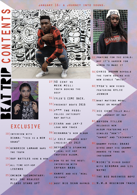
*Screenshot of D.P.S is old stage however the print outs I handed to sample group were of the latest versions of the pages, I had prepared this post before hand so that I could quickly fill in the results before posting.*

After finally completing my media product I asked the sample of young people in my target audience category to review my project once more to see what they thought of it. Overall, my target audience sample liked my spread a lot and the majority said they would buy it if they saw it so I do believe it is a successful media product as it does appeal to people aged 16 - 19.

Would you buy this magazine?
13/16 said Yes
3/16 said No

Do you think this is a successful media product?
14/16 said Yes
2/16 said No

Does this magazine look interesting?
12/16 said Yes
4/16 said No

Do you think that the models have been presented fairly, and not in an offensive or objectified manner?
15/16 said Yes
1/16 said No

Which is the most successful page?
8/16 said the D.P.S
6/16 said the Cover
2/16 said the Contents

Do you have any further comments?
5/16 said Yes *Below are some quotes from these*
11/16 said No

P1: "I think this looks like someone professional could have made it. My favourite page is the cover because it looks cool."

P2: "The magazine is actually good. I would definitely buy it."

P3: "I can't think of a weakness so I can't tell you how to improve it, but overall it's a good magazine."

P5: "It looks real. I really like it, even the way the article is written seems like it was written by a professional. There's nothing boring about your magazine."


Monday, 11 April 2016

Final double page spread


The structure of this page is very clear as the main body is fit onto one rectangle and in three clearly seperate columns. This allows my page to look more professional and organised.

 The colours on the page are conventional of hip hop magazines (I saw this in my genre research). The colour red is suitable for my product as it has connotations of urgency, passion and danger. Gold is symbolic of wealth and power - this is what many popular/mainstream rappers aspire to achieve and also say that they have in their songs (e.g. ASAP Rocky M$ or Kanye West- Stronger). The combination of black and white is timeless and the strong contrast between the two colours reflects the harsh reality and honesty of the artist on the double page spread's lyrics (the outspoken lyrics are commented on in the final paragraph of the article so a link can be made directly).

The article is written in a sit down interview format. Instead of writing the questions and then their answers; I decided to write an article with embedded quotes as in my primary research I saw that hip hop magazines such as XXL do this quite often. In the article I discussed the rappers childhood, future ambitions, album progress, journey so far and other topics as such.

My photo challenges stereotypes of young black men within society as they are stereo-typically racially profiled as gang members and associated with violence and other criminal activities. As violence and weaponry are used a lot in hip hop it would have been easy for me to slip into this convention and promoted these things also. However, I refrained from using the typical hip hop look but still created an urban costume by using bold colours and shapes. I did not use any guns, money, imitated drugs or violent imagery in my media product as my magazine is aimed at 16 - 19 year olds and I do not want my magazine to encourage such behaviour.  Furthermore, this photo sticks to genre conventions as my research helped me conclude that many hip hop magazines use direct mode of address to communicate with the readers. I believe this eye contact is good in my case as hip hop is supposed to be very direct and confrontational.

I would rather my magazine encourage a fresh face for hip hop and one that completely disproves stereotypes surrounding the genre of music and also different social groups across society. To enhance this photo of Peter and to make him look more like a rapper, I edited his hair to make it a more trendy image by giving him a blonde - high top this hair style is very popular among young people at the moment and so makes my model look relevant to the here and now. 
I believe this page will appeal to my target audience as it has a clear colour scheme and lay out. Furthermore, I think the graffiti/quirky background.


As many other professional publications do, I made sure to place my logo on the page also.