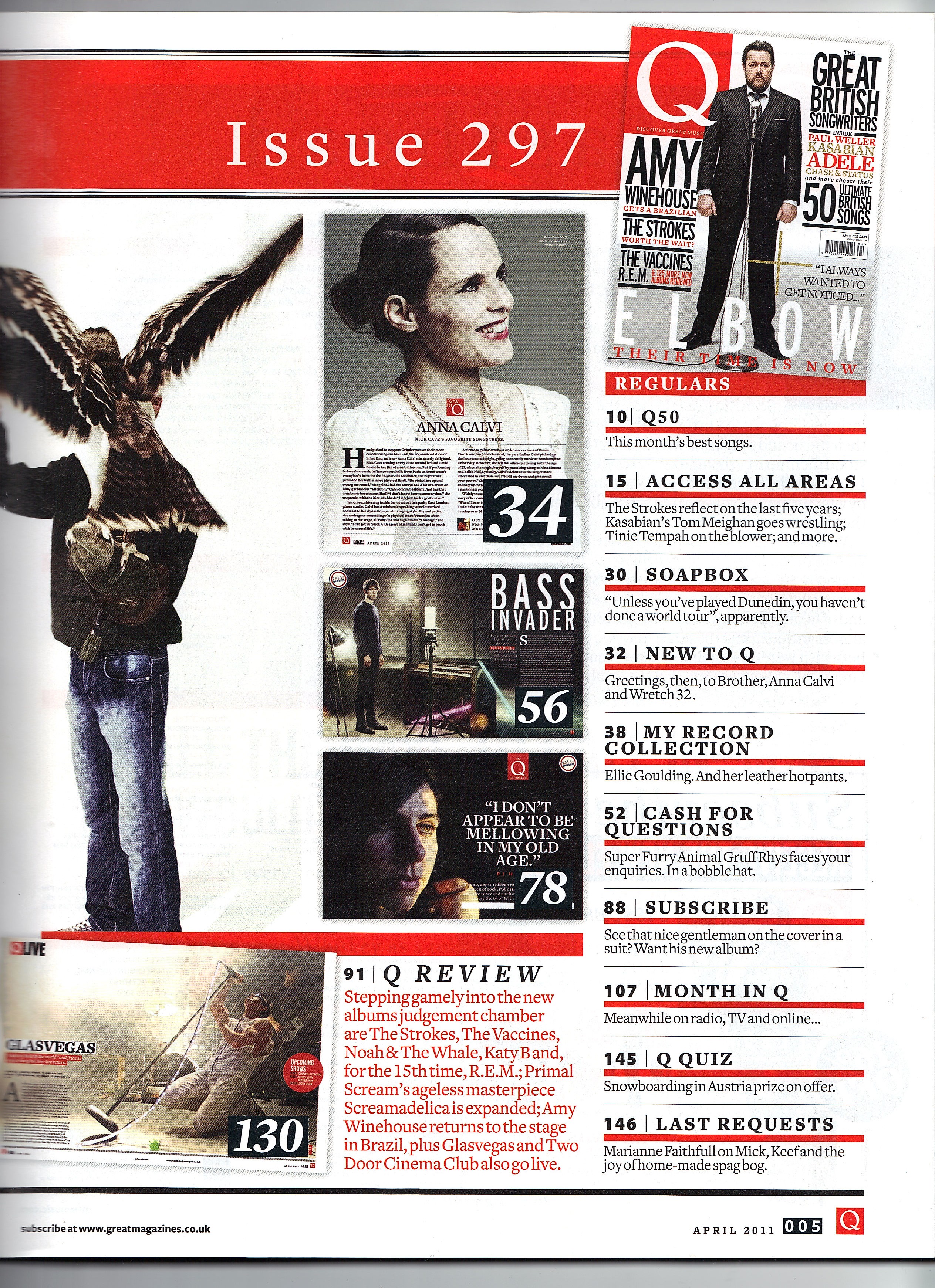
The picture on the right follows magazine conventions and is inspired by other AS contents pages I have come across online. However, the lay out on the left is more original. Nevertheless, after looking at more professional magazines (such as Dazed & Confused), I have realised that I may have too many photos on the pages whereas the professionals have kept the pages minimal. I believe the minimal approach would work better with my front cover so I will plan a new lay out, with perhaps less images (maybe 2/3) and an interesting background.


