 |
| Although this cover is successful as it is organised and neat, I feel as though there is too much going on. The pictures squash the text into one corner of the page and the various pictures make it difficult to focus on a specific one. I will try to avoid this in my magazine as although the photos are important, I am aware that younger people are more easily influenced and so I would rather they focus on the content of my magazine. Therefore, I think that I will have more writing than pictures on my contents page. |
 |
| This Billboard contents page looks good. The colour scheme is well organised and the text plays a bigger part on the page than the photos which I appreciate more. Furthermore I like the varied sizes of text,as it separates more relevant topics from those that may not be as relevant. I will also use this in my contents page. |
 |
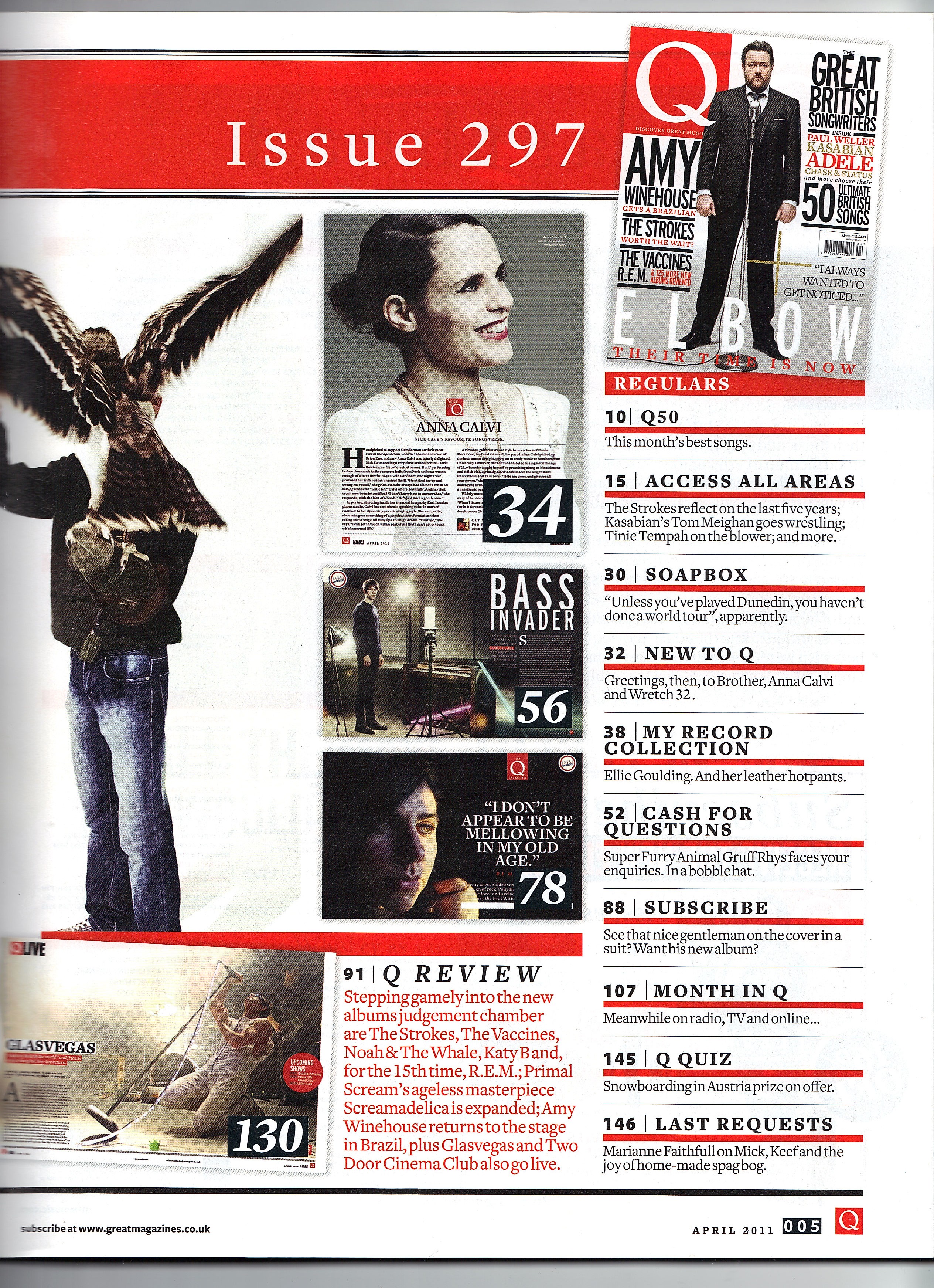
| I like the minimal approach of this magazine. The red numbering along the sides of page titles contrasts against the black text, making the text look more important as red is a colour that connotes urgency. I will try to use red page numbers too. |
 |
| The colours on the page go together really well and compliment the main image. I was planning on using three pictures on my cover but this also looks very good. I like that the word contents is broken down into three pieces, I will not use this on my contents page but it is definitely a good trick to use extra space and also add to the aesthetics of the page. Perhaps I might use this idea on my double page spread, maybe break down a quote into three pieces of text. |
No comments:
Post a Comment