

When creating the initial design I used the magnetic lasso tool to create new layers in order to move the model ahead of all sell lines and the masthead. This was to portray the importance of my "celebrity". Also, using the tool enabled me to blur the original background copy which made the copied layer stand out more, again highlighting his importance and stance on the cover. The contrasting colours work well to create a 'hard edge'.
To emphasise this contrast I added elements of red and white to the text which was placed above transparent boxes.

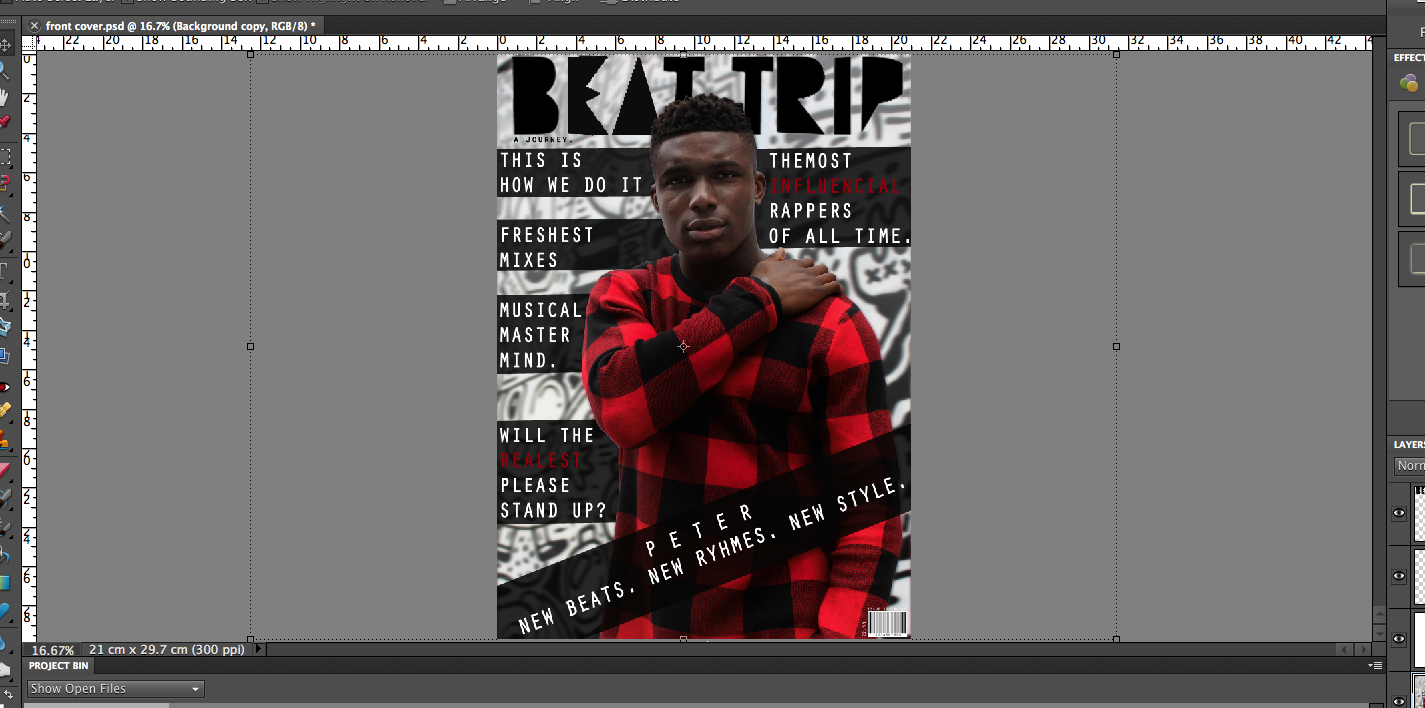

Small details like the barcode, issue number, price and the contrasting layers all add to the overall quality of the page. If I do decide to use this as my final cover then I will continue to develop it and post the stages on my blog.
No comments:
Post a Comment