Showing posts with label Post-Production. Show all posts

Monday, 28 March 2016

Double page spread developments p2


I have written the article piece and am now seperating it into three collumns as this is a typical lay out for magazines. To make this process more accurate I am using the grid on Photoshop to ensure that all three collumns are equal.
To place Peter infront of the box I used the magnetic lasso to crop his shoulder and make it a new layer then placing it over the rectangle. The purpose of the rectangle is to make my page more accessible, as it would be bard to read over the graffiti background. However, I did lower the opacity of the layer as I wanted the background to still be seen.


There was a lot of empty space on the upper right corner and this hindered the balance of my page so I decided to add a large quote from the main body of writing as this is something else I noticed during my primary research of magazines.


To keep the page consistent and also make it easier for my audience to read, I again used white rectangles below the text.

Again, to move Peter infront of the boxes, I used the magnetic lasso tool to create a layer. I then zoomed in to use the quick selection brush tool to really erase extra pixels to create a smoother and more professional image.

This is what it looked like when I was complete.

I was deciding which font and colour to use for my byline, in the end I decided to use the same gold colour as the main page. (See below image for changes).

This is the page I have so far, I still need to move my article into three columns to make the page look less clustered and more professional as in it's current state it looks like the fourth column is squashed. *I will post the updated/final d.p.s as soon as possible*


Thursday, 24 March 2016

Double Page Spread - First Developments


I am currently working on my double page spread. To start my page I first selected a picture that could link back to the contents page. I am now trying to decide on a colour scheme and font style for the title, my belief is that having a red black and white page will be typical of the convention and not  new so I will try to use one additional colour - I am deciding between gold, purple or blue as these are colours that came up a lot during my research of the hip hop genre. I am deciding which font to use as this is also an important factor of the page because it sets the tone for the article.


Friday, 18 March 2016

All contents pages and captions

This was my initial contents page, there will be a post talking about how I made it on my blog as it is the one I have decided to use. When I first made this page I liked it but later I realised it was not so good so I decided to try and experiment with different pages. However, I had an issue with doing so as my USB crashed, leaving me with no original documents and only screenshots of the three images I had already used for the contents page above.
This is the first remake I created, it took me around four hours over the course of two school days, this included planning time. I decided not to use this page as it did not fit the conventions of hip hop magazines at all and looked more like a movie listing flyer. The colours on this contents page make it appear too childish for my target audience and creates a page that ultimately does not suit the atmosphere of my other pages.
A strength of this page however is the layout in my opinion, although it lacks a clear structure when it comes to text, the boxes around each category make the page appear more clear. I put the writing that links to a picture in white so that it would stand out against the bold colours.
 

This was my final attempt to redo my contents page. I believe that if I had time to complete and improve this page then it would've potentially been my final contents page. However, I did not have enough time to finish it the way I would have liked to as I had to move on to my double page spread and evaluation. This page was influence by an existing contents page in which there was text overlayed on a photo of  Doctor Dre. I believe this is a strong photograph of Chloe as I captured a moment where my model successfully communicated her attitude. I again only incorporated colours from the photo into the background and text. If I could improve this cover I would start by re-editing the title text as it does not suit the page. The word "CONTENTS" should have been done in a different font as it looks squashed. Furthermore, the grey colouring also does not fit into the page even though I took the shade of grey from the photo itself. 


*I was not able to post the progress during the stages of these contents pages as they took up a lot of my time, especially the original page. This was because I had to align all of the text, change colours, edit photos etc.*

Wednesday, 27 January 2016

Cover, Final and update.


These are the three main stages of my cover, in which I was making crucial decision about the house style of my page. I did use the Directors criticisms as some constructive feedback and changed the size of the model to decrease the amount of white space on the page. To further reduce this I added my tagline and date: "JANUARY 16: A JOURNEY INTO SOUND" this tagline will change every month, e.g. "FEBRUARY 16: A JOURNEY INTO SOUND".  In addition to this, combining the tagline and date allowed me to remove the date line next to the bar code (AUGUST 2015) which improved the overall look of my page as it now appears less clustered. 
This is my final cover:
I created my final cover by mainly relying on the grid view so that I could place everything in it's proper position on the page to avoid disrupting the harmony of the composition of graphics. 
I believe the gradient layer with altered opacity levels was a significant factor in improving the aesthetic of my cover as it made it appear more professional. This links back to my Target Audience research, in which one of the students I interviewed commented that the colours were too bright. I tackled this issue with the use of the additional layer as it matified the colours and reduced the brightness, causing my magazine to look less "cheap" and tacky. 
Furthermore, I did reduce the specs around the anchoring text which also made the writing more legible. I also followed the feedback of another student I interviewed and reduced the size of the sell lines to create more space around my model's head, this makes her the focal point of the page and strengthens her importance on it. This factor, combined with the direct mode of address and shot angle/zoom creates what I believe is a powerful image, with a look that is almost careless yet also very mindful.
I believe the colours on the page all work together very well. 

Close-up of tag line on page. 


I believe the half/half filtered image links to the anchoring text as it shows the transition of a person,  implying her metamorphosis was overwhelming as it was portrayed visually on a cover. The effect also links to the belief around hip hop, the ideas surrounding people's alter egos in the industry: having to act hard or as someone you are not. This is presented in the use of two contrasting colour schemes on one model, showing a clash of two natures in one person.

I continued the half/half idea into the anchoring text also to suit the house style.


New bar-code, less clustered, looks more professional. 

Friday, 15 January 2016

Cover Stages & Production

This was my very first cover image, however, I felt as though it was lacking character so I decided not to use it.

I decided to use a close up shot instead of a medium close up, as I felt it communicated the emotions expressed by the model and cover page more effectively.
I was still adding sell-lines around the head of my model.  This was so I could partly portray that she is the most important graphic on the page by drawing more attention to her face, which is composed centrally.


I achieved this look by accident when highlighting parts of my page, but I felt as though it gave my magazine an unusual look and made it look 'cool' as it emphasized on the idea of being unique. This inspired me to play with negative filters and experiment with my cover image a little more.


After splitting my image in half, (half negative filter) I decided changing half of the anchoring text would make it suit the house style more.


This is how the original bar-code layout of my magazine was. However, I have decided to change it to appear less 'clunky'.
This is my initial cover:
 I recently was given the opportunity to talk to the Art Director of Glass Magazine, who said that he really liked my cover and was able to guess the genre of music it belonged to. This was important as it showed that my cover page relates to the genre of music I am targeting. However, he did also give me some critical feedback, this was that the text is too close to the models head, and that the anchoring text could be pushed down or the model's head could be pushed up to allow her to be easily seen. I will be making these changes and some more corrections that I have noticed myself over the next few days. For example, the 'specs' of coloration around the anchoring text are distracting, so I will use the clone stamp to make the image have block colours around the text instead. Furthermore, I will add a layer of nearly transparent purple to white gradient over the top of the cover to make it appear less tacky/bright and to create a 'flossy but matte' finish to the page. I will also take into account the advice Ben gave me as I am currently planning on reducing the size of the sell lines, and perhaps putting my tag line at the top of the page to fill in the empty white space which the Director commented: "makes me feel like there's something missing" and is "distracting". 


Thursday, 14 January 2016

Cover page final ideas


I have decided to use this filter as I think it makes the cover look unique and vibrant. Furthermore, this will appeal to my T.A of 16 - 19 year old young adults as it will stand out and make a bold, eye catching statement. A bold statement is something that my target audience favours.

However, I have not decided which picture I will use with the filter so I will try the scheme with the above two pictures and pick the best final cover - much like industry professionals who make several covers and then pick a final one. This is because it gives people a better idea and perspective on their work, and helps them to make the best out of a concept.

Wednesday, 13 January 2016

Exploring cover page layouts


After my research I felt inspired to explore different colour schemes and lay outs. I am currently still doing this but like the top-left picture the most. 

Tuesday, 12 January 2016

Exploring themes


My model has nice eyes that can communicate successfully to my readers, so I wanted to see if I coudl emphasise them.

I used the blue omni light effect to create a unique look, then the magnetic lasso tool to cut around her eyes and created a new layer. I finalised the "cut-paper" look by adding a drop shadow and placing the layer above her eyes.


However, I did not like the final image as I believe the blue lighting and eye effect make it appear more Sci-fi than hip-hop so does not fit my magazine genre. 


I also tried red/black schemes but felt like it did not look 'high-quality' and instead looked tacky and cheap, so I decided not to use any of the lighting effects. 

Wednesday, 23 December 2015

Developing Cover 2


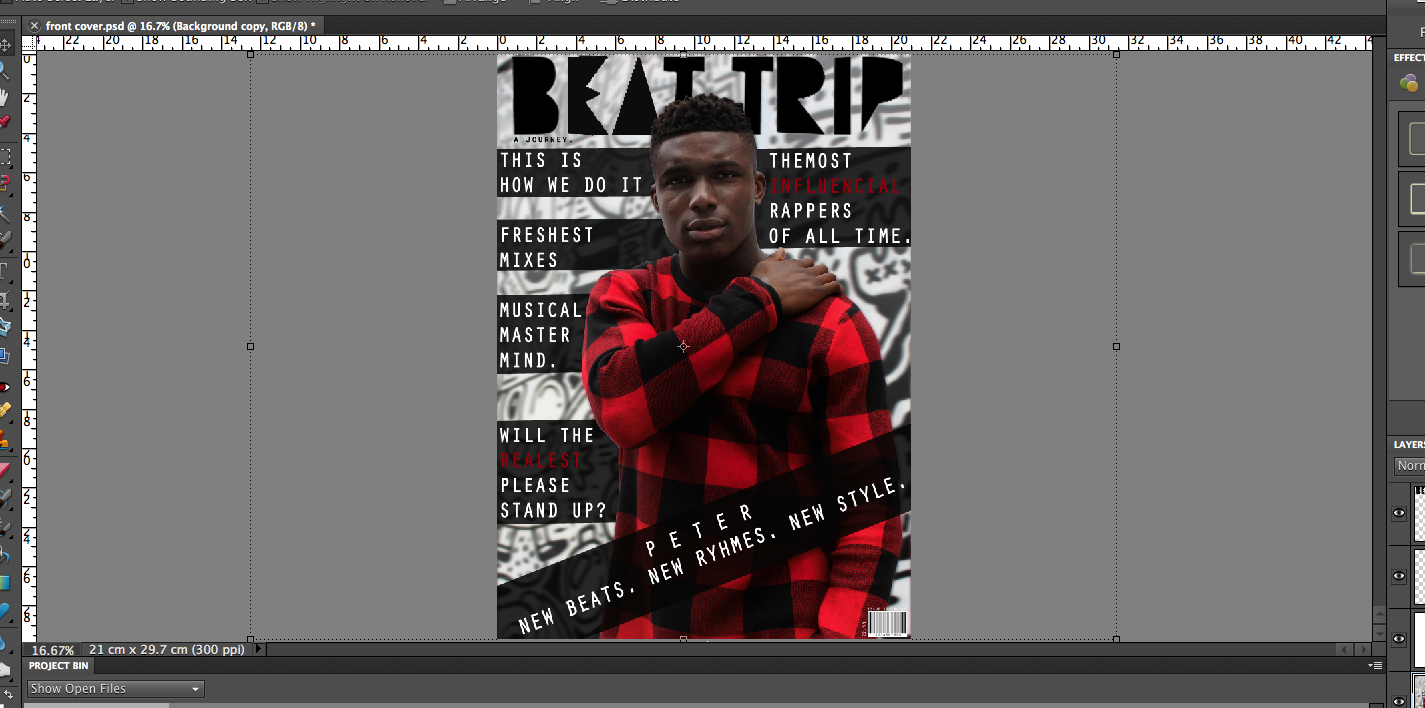
When creating the initial design I used the magnetic lasso tool to create new layers in order to move the model ahead of all sell lines and the masthead. This was to portray the importance of my "celebrity". Also, using the tool enabled me to blur the original background copy which made the copied layer stand out more, again highlighting his importance and stance on the cover.  The contrasting colours work well to create a 'hard edge'.
To emphasise this contrast I added elements of red and white to the text which was placed above transparent boxes.


Small details like the barcode, issue number, price and the contrasting layers all add to the overall quality of the page. If I do decide to use this as my final cover then I will continue to develop it and post the stages on my blog.

Sunday, 20 December 2015

First attempts at front cover


These are not my final covers, they are my attempt at creating cover pages and exploring different themes. These covers are successful as they apply my selected colour scheme, the costumes (caps, hoodies, beanie hats. bold colours) are all conventional of modern-day hip hop. In 2/3 of the covers I used direct mode of address as this was a trend amongst other hiphop magazines such as XXL and Vibe. The first cover is my least favourite as it looks empty and cheap. The second cover is my most preferred as it is bold, unique and fierce. The colours, image and font all work really well together. My final cover will be of a similar look to this. I decided to use lines to recreate/link to the pattern on his jumper, while also making the text more accessible as it was difficult to read without the box due to the background.

*EDIT* As I have not yet taken any other pictures, I have decided to further develop the top right cover (second) and improve it. This may be my final cover.