Showing posts with label Pre-Production. Show all posts

Saturday, 6 February 2016

Possible contents page lay out ideas

Here are two ideas that I have for my contents page lay out drawn in rough.

The picture on the right follows magazine conventions and is inspired by other AS contents pages I have come across online. However, the lay out on the left is more original. Nevertheless, after looking at more professional magazines (such as Dazed & Confused), I have realised that I may have too many photos on the pages whereas the professionals have kept the pages minimal. I believe the minimal approach would work better with my front cover so I will plan a new lay out, with perhaps less images (maybe 2/3) and an interesting background.

Thursday, 4 February 2016

Contents page research

Although this cover is successful as it is organised and neat, I feel as though there is too much going on. The pictures squash the text into one corner of the page and the various pictures make it difficult to focus on a specific one. I will try to avoid this in my magazine as although the photos are important, I am aware that younger people are more easily influenced and so I would rather they focus on the content of my magazine. Therefore, I think that I will have more writing than pictures on my contents page.
This Billboard contents page looks good. The colour scheme is well organised and the text plays a bigger part on the page than the photos which I appreciate more. Furthermore I like the varied sizes of text,as it separates more relevant topics from those that may not be as relevant. I will also use this in my contents page.
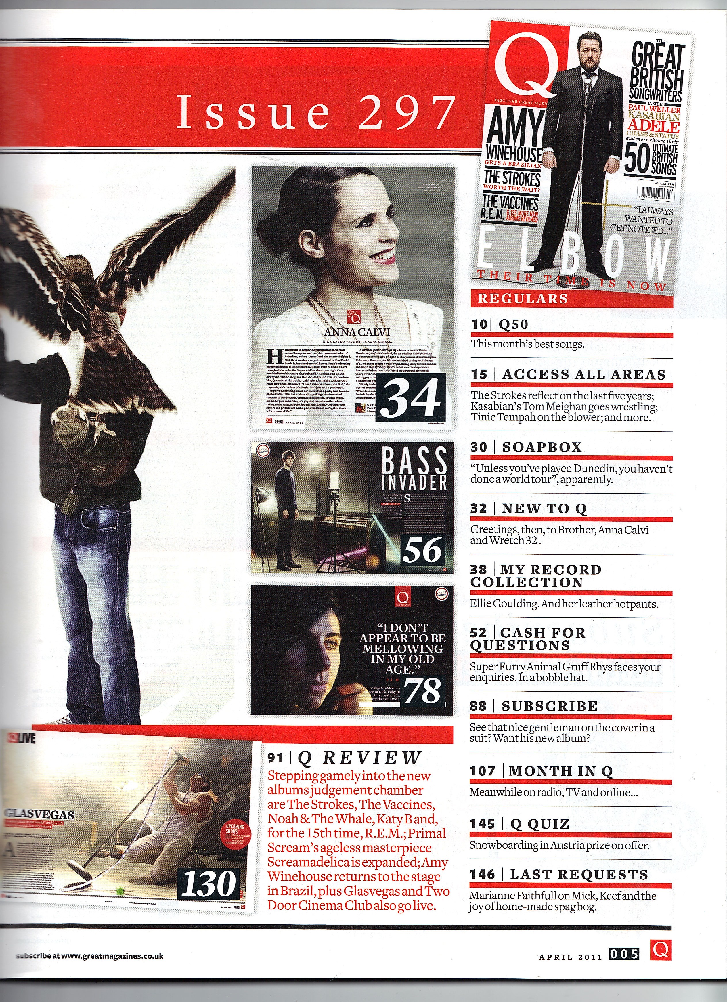
I like the minimal approach of this magazine. The red numbering along the sides of page titles contrasts against the black text, making the text look more important as red is a colour that connotes urgency. I will try to use red page numbers too.

The colours on the page go together really well and compliment the main image. I was planning on using three pictures on my cover but this also looks very good. I like that the word contents is broken down into three pieces, I will not use this on my contents page but it is definitely a good trick to use extra space and also add to the aesthetics of the page. Perhaps I might use this idea on my double page spread, maybe break down a quote into three pieces of text.

Monday, 11 January 2016

Research: "Read This If You Want To Take Great Photographs Of People" by Kenny Carroll


My media teacher let me borrow this book to look at some tips on photography. It enforced my belief that a picture is worth a thousand words, and gave me some new ideas about editing my cover image. For example, I am right now exploring different colour effects on my pictures (B&W, Blue Omni etc.) This book gives good guidance on how to create photos with depth by controlling the mise-en-scene and shooting the photo at the right moment to capture the feelings.

Tuesday, 15 December 2015

Photoshoot Schedule


Above is the photoshoot schedule that I will be sticking to strictly in order to take all my photos at the right time and have time to edit them etc. These are the dates and times that I have arranged with my models already so if everything goes to plan then they will make these dates. 

Thursday, 10 December 2015

Magazine Pitch


Today we pitched our initial magazine ideas to the class. The password to view my pitch is: media

Thursday, 3 December 2015

Magazine Masthead & Title


Inititally, I designed some mastheads for my music magazine. My primary audience research revealed that out of a sample of 50, 39 16 to 19 year olds preferred the title "Beat Trip" instead of "trill." or "beats." My idea behind "beat trip" relates back to popular hip-hop slang and culture. 'Beat' refers to the musical aspect of my magazine (e.g. hip hop is based primarily on rhyming over strong beats), and 'Trip' is linked to the idea of music being an experience- or journey. It is also linked to the common slang use of the term 'trip' in hip-hop which refers to drug use/anger. My masthead portrays to my audience that music should be an indulgence and promotes the use of music instead of drugs. 

The above designs were free-hand sketches of some ideas that I thought would appeal to my audience while also complimenting the cover page. I would like my cover to be simple so more attention will be on the actual text and content rather than the appearance. This is why my masthead designs were not appropriate for my design criteria. 


These are some masthead designs that I found on 'dafont'. I believe that these are better for my cover as they look more professional which will make my magazine look as if it is of higher quality. 
This is the final design that I have selected. This is because 16/24 people voted for this masthead and also because it is the most simple design. However, the distortion adds movement and character to the title. It also could be symbolic of the 'beat' marks on a heart monitor or the dysfunctional, imperfect lifestyle that hip-hop represents.

*EDIT* 16.12.15
This is the font I will use as it looks better on the page. It turned out that this font looks of a higher quality as there are less white pixels surrounding the font, even when using the magic wand tool the first font would look pixelated.

Target Audience Research


This is a sample of the people I questioned for my TA research. They fit into my target audience as they are all aged 16-19 and belong in the C2DE category. I individually asked each student questions about the industry etc.


Questions & Answers

1) What genre of music do you generally listen to? 
13/24 said that they listened to hip hop the most, 4/24 said that they listened to indie or alternative music. 6/24 said that they liked listening to R&B. One person out of the sample said that they listen to any genre. The answers to my first question have lead me to decide to stick to the genre of hip-hop for my magazine. 

2) Would you prefer to see a colourful magazine cover or a set theme? 
14/24 voted set theme whereas 10/24 voted for a colourful cover. These results show me that I should use a set colour scheme in order to please my target audience.

3) Out of the names: TR!LL, beat$, ego, Beat Trip and Grillz, which do you prefer for a music magazine? 
Sample results: 
Beat Trip- 10
Trill- 8
Beats- 1
Ego- 2
Grillz- 3

The results show me that my TA are more in favour of "Beat Trip", so this will probably be the title of my magazine.

4) Which colour scheme do you think best suits a good magazine cover? 
Sample results:
Red, white, black, blue tones - 13/24
Yellow, green, red tones - 7/24
Orange, red, pink tones - 2/24
Grey, purple, white and black tones - 4/24

These results suggest that my TA would prefer a simple colour scheme which consists of red, white, blue, and black tones. This is interesting to me as hip hop magazines I have seen in my research have also used similar colours.

5) What sort of celebrities would you like to see on the cover of a music magazine (hip hop in particular)?
The answers varied but celebrities such as Beyonce, Kendrick Lamar, J Cole, Nicki Minaj and Asap Rocky.

User Profile: Demographic, Psychographic and Geographic factors.


Tuesday, 10 November 2015

Research: Case Study 2 "VIBE Magazine"

The second focus of my research will be VIBE magazine, as it is also a famous R&B/Hip-hop publication.

The house style of Vibe is typically compact. The use of bright colours and bold fonts create a 'fresh' and urban theme. The masthead colouring varies however the composition of the page remains the same every issue, with the masthead being placed at the centre-top of the cover. Sell lines are a very significant part of this magazines over, as unlike other hip-hop magazines, they take up a lot of space on the page- sometimes almost framing the main image. The most frequently used colours on these covers are: red, black, gold and white- bringing together powerful colours and successfully portraying themes of a rich, strong and violent lifestyle. 

Unlike my first case study; this magazine uses females on the cover more often. Furthermore, these women are sometimes shown as half-dressed while other times fully clothed (I believe this could be a reflection of their songs). However, they are still somewhat sexualised with either their poses or costumes. Although this magazine provides more representation of women, it also fails to portray an accurate image and somewhat degrades women.

The main image is usually a medium close-up, but close ups and full-body shots are also amongst those that are used. Celebrities that have been pictured on this cover include: Snoop Dogg, Lauryn Hill, Biggie, Tupac and Jay Z. This magazine also uses direct mode of address which can be confrontational and just like my first case study is reflective of the violent lifestyle associated with hip-hop. I will use direct mode of address on my magazine cover.

Overall this magazine has similar themes to XXL, some which I am planning on using and some which I will not. For example, I will use D.M.O.A.


Thursday, 5 November 2015

Research: Case Study 1 "XXL Magazine"


XXL is a popular magazine that focuses on R&B/Rap its first issue featured Jay Z and Master P on a "double cover".


Since its first published copy XXL magazine's house style has consisted of the masthead being on the upper left corner of the page, sometimes being slightly obstructed by the main image. Sell-lines present on the page usually surround the main image rather than cover it, reminding the audience the importance of the celebrity. The typical colour scheme of this magazine consists of white, black and red. Other bright contrasting colours are also used on the page.   This creates a sharp and bold look on the page, perhaps reflecting hip-hop's rough edge. The colour red has connotations of danger love and passion, whereas white is almost the complete opposite connoting themes of purity, honesty and hope. This juxtaposition created by the colour scheme cleverly brings together themes of hip-hop and what the music genre itself represents. 

Although this is a very successful magazine , it fails (in my opinion) to portray women and men as equals to this day. The magazine rarely has a female artist present on the cover and even when it does she is often pictured while half dressed.  As this is a hip-hop magazine these over-sexualised images of women are typically linked to the genre it presents. However, nowadays hip-hop is a tool that some female artists use to empower women all around the world, not just a genre of music. We are made to believe half naked women dancing on a stage or in the back of a rap video shows power and independence, and sure this could be argued for in some cases. Yet, we as a society rarely (if ever) pay attention to the ladies who refuse to take their clothes off for fame but instead use their lyrics to create power where this gender is presented in the media as having none. This is the first thing that struck me while looking through the covers. I will be using hip-hop as my genre however I will not portray women in this way on my magazine and instead use a counter-type image if I choose to use a female model. 

The main image is usually a close up when a male artist is on the cover. However, for females a medium shot is a more popular choice- this could again be linked to the over-sexualisation of women within the genre as it shows more of their body to readers. Costumes on the cover are mainly casual wear that is associated with an urban lifestyle: hats, bandanas, baggy trousers and denim. Some celebrities that have been presented on this magazine more than once include: Jay Z, Snoop Dogg, Tupac, and Eminem. Other typical celebrities that could be on this magazine might be any successful rapper or R&B artist. Direct mode of address is nearly always present on XXL's covers as it allows readers to connect with the main image. On the other hand, strong eye contact could also be described as confrontational, again highlighting the dangerous lifestyle that is presented within rap music.  

Fonts - much like the colour scheme and main image - are bold. The typography on the page consists of different sizes, perhaps signifying the importance of each article. Alternatively, the different sizings could be a device used by the editors to make sell-lines that they think will engage the target audience a bigger size than others. The varying sizes, colours, and fonts add movement to the cover.  The types of articles used varies from music to lifestyle. 

Overall, XXL magazine uses layouts and images to reflect conventions of hip-hop music. I will use some of their tools as inspiration for my own magazine.


Friday, 23 October 2015

Main Task, Music Magazine Covers

To further advance my research stage, I have refined the genre of music that I will be using in my project to R&B. I found some popular magazines and looked at their covers. It is noticeable that in this genre of music magazine a  trend is to use mainly bold and contrasting colours. I will use this trend in my main task also as it will make my magazine appear professional and as if it is of a higher quality.
I believe that these music magazines appear less clustered and more simplistic (like the 'old' magazine covers).                                                        

Main Task, researching music magazines


This moodboard briefly presents some of my favourite magazine covers that I came across during my research.  The top row is made up of modern magazines whereas the bottom row is made up of older ones.

         Although there are some differences the similarities are also evident. 
Perhaps the simple nature of the older magazines compared to the modern ones could be reflective of life once being simple, and how busy it has become- with the addition of new technology and celebrities. Also, the multiple sell lines on newer covers suggests that it is now harder to sell magazines to people, that the creators have to try even harder to sell their product nowadays. This could be because most things in the present time are televised, or published online, so people do not need to spend money to get the same information (and possibly more) in a quicker, more efficient way. 

Monday, 21 September 2015


Earlier this week while looking for magazines. #Research

As part of my research, I visited various stores and took pictures of magazine covers so that I could later  base my idea on these already popular magazine's covers.

Thursday, 17 September 2015

Camera Angles & Shots

A short presentation, with quick notes about camera angles and shots.

Magazine Research.

As part of my Unit 1 coursework, I have started to research magazine covers.

I started by looking at the 2006 December issue of 'Esquire'.

I labeled the structure of the cover and wrote some short paragraphs under the titles in order to add my own notes.