Friday, 15 January 2016

Cover Stages & Production

This was my very first cover image, however, I felt as though it was lacking character so I decided not to use it.

I decided to use a close up shot instead of a medium close up, as I felt it communicated the emotions expressed by the model and cover page more effectively.
I was still adding sell-lines around the head of my model.  This was so I could partly portray that she is the most important graphic on the page by drawing more attention to her face, which is composed centrally.


I achieved this look by accident when highlighting parts of my page, but I felt as though it gave my magazine an unusual look and made it look 'cool' as it emphasized on the idea of being unique. This inspired me to play with negative filters and experiment with my cover image a little more.


After splitting my image in half, (half negative filter) I decided changing half of the anchoring text would make it suit the house style more.


This is how the original bar-code layout of my magazine was. However, I have decided to change it to appear less 'clunky'.
This is my initial cover:
 I recently was given the opportunity to talk to the Art Director of Glass Magazine, who said that he really liked my cover and was able to guess the genre of music it belonged to. This was important as it showed that my cover page relates to the genre of music I am targeting. However, he did also give me some critical feedback, this was that the text is too close to the models head, and that the anchoring text could be pushed down or the model's head could be pushed up to allow her to be easily seen. I will be making these changes and some more corrections that I have noticed myself over the next few days. For example, the 'specs' of coloration around the anchoring text are distracting, so I will use the clone stamp to make the image have block colours around the text instead. Furthermore, I will add a layer of nearly transparent purple to white gradient over the top of the cover to make it appear less tacky/bright and to create a 'flossy but matte' finish to the page. I will also take into account the advice Ben gave me as I am currently planning on reducing the size of the sell lines, and perhaps putting my tag line at the top of the page to fill in the empty white space which the Director commented: "makes me feel like there's something missing" and is "distracting". 


Thursday, 14 January 2016

Cover page final ideas


I have decided to use this filter as I think it makes the cover look unique and vibrant. Furthermore, this will appeal to my T.A of 16 - 19 year old young adults as it will stand out and make a bold, eye catching statement. A bold statement is something that my target audience favours.

However, I have not decided which picture I will use with the filter so I will try the scheme with the above two pictures and pick the best final cover - much like industry professionals who make several covers and then pick a final one. This is because it gives people a better idea and perspective on their work, and helps them to make the best out of a concept.

Wednesday, 13 January 2016

Exploring cover page layouts


After my research I felt inspired to explore different colour schemes and lay outs. I am currently still doing this but like the top-left picture the most. 

Tuesday, 12 January 2016

Exploring themes


My model has nice eyes that can communicate successfully to my readers, so I wanted to see if I coudl emphasise them.

I used the blue omni light effect to create a unique look, then the magnetic lasso tool to cut around her eyes and created a new layer. I finalised the "cut-paper" look by adding a drop shadow and placing the layer above her eyes.


However, I did not like the final image as I believe the blue lighting and eye effect make it appear more Sci-fi than hip-hop so does not fit my magazine genre. 


I also tried red/black schemes but felt like it did not look 'high-quality' and instead looked tacky and cheap, so I decided not to use any of the lighting effects. 

Monday, 11 January 2016

Research: "Read This If You Want To Take Great Photographs Of People" by Kenny Carroll


My media teacher let me borrow this book to look at some tips on photography. It enforced my belief that a picture is worth a thousand words, and gave me some new ideas about editing my cover image. For example, I am right now exploring different colour effects on my pictures (B&W, Blue Omni etc.) This book gives good guidance on how to create photos with depth by controlling the mise-en-scene and shooting the photo at the right moment to capture the feelings.

Sunday, 10 January 2016

Final photo shoots for cover image 10-20 December


This photo shoot was more successful than my last one as the costume is more vibrant, the hair style also suits the conventions of Hip-Hop. I will use one of these pictures as my cover image.


One of these will be for my contents page.

Wednesday, 23 December 2015

Developing Cover 2


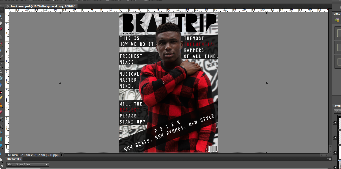
When creating the initial design I used the magnetic lasso tool to create new layers in order to move the model ahead of all sell lines and the masthead. This was to portray the importance of my "celebrity". Also, using the tool enabled me to blur the original background copy which made the copied layer stand out more, again highlighting his importance and stance on the cover.  The contrasting colours work well to create a 'hard edge'.
To emphasise this contrast I added elements of red and white to the text which was placed above transparent boxes.


Small details like the barcode, issue number, price and the contrasting layers all add to the overall quality of the page. If I do decide to use this as my final cover then I will continue to develop it and post the stages on my blog.