I once again presented the sample of 16 students at my school my media product and asked them for their comments, below is a selection of some quotes on what 6/16 students responded.
P1: Male, aged 18, Year 13
"I think the photographs are good I really like the poses. The models all have an attitude that makes them look hard- just like they are supposed to if they are rappers."
"The articles look very interesting to me, I like that there is a wide range of topics even though they are all about music or musicians. It shows the writers creativity"
"I think it looks quite edgy and tough. It does look like a hip hop magazine to me because there are rappers down the side and her hoop earrings."
P2: Male, aged 17, Year 12
"This page looks really cool."
"My favourite thing on the page is the background, I like the triangle and the colours."
P3: Female, aged 16, Year 11
"The photos are really nice, I like that you have used different angles to get different pictures. It's like looking at a gallery."
"I think the genre is hip hop because of what the models are wearing, how they are posing and also because of what the text on the page says."
P4: Female, aged 17, Year 12
"I like the article titles they seem like they would be interesting."
P5: Male, aged 16, Year 12
"I like the lay out of the page."
"I really like the little splashes of red it makes the page more vibrant and less purple."
P6: Female, aged 18, Year 13
"I like it."
"The text is nicely put together."
Overall, I have found that my contents page does appeal to my target audience. They especially liked the colours, photographs and range of articles.
Tuesday, 22 March 2016

Saturday, 19 March 2016
Final contents page 1

This is my final contents page. To create the background: I made two layers of plain white fill and added textures and filters to them to create a new theme that would suit my magazines style and look unique. I left the bottom layer white and used many filters and gradients over the one on top (darker purple, has blue blotches) and then cut a triangle out of the darker layer by using the magnetic lasso tool on Photoshop to reveal the white surface below. This process was completely experimental, as I was just trying to make my page different. The colours on the page go together well as I only incorporated colours that could be taken from the photos on the page by using the eye dropper tool.
I used Beattrip's tag line on the top of the page as it looked empty and I felt like repeating the tag line would add some consistence to the magazine. I chose to have the name of the magazine and contents down the left side as that's how it was on the cover page. I edited all the pictures before adding them to the page on Photoshop, just to either make the colours brighter and bolder or seem darker. For example, the main image is of Peter, I chose to have it bolder as he is wearing red and this contrasts with his blakc and white background.
Chloe's picture on the top right of the page is slightly darker, as when looked at properly, this suits the mood of her photo more. I believe all the colours on the page work well together but are also not traditionally used together. For example, violet, purple, red, blue and white are not colours that are typically coordinated together - but I believe they do work well on this page. Again, just as on my cover page, I put a purple-to-white gradient layer over the final piece, this was to keep the matte look consistent to ensure that the pages would work well together. I reduced the opacity of this additional layer to 35% so that the page could still be seen, but I moved the images and title above this layer so that they would remain bold.
To create the image of Diana on Photoshop, I used the magnetic lasso tool to crop her out of the original photo and then duplicated her layer onto an image of Peter as I wanted to have a graffiti background instead of the original plain white background. I then zoomed in and used the quick selection brush tool to delete excess pixels that made it obvious Diana was not really infront of the graphic wall. Following this step I then used the blur tool to blend the outline of Diana's layer with the background. I also altered the colours of the background using the hue and saturation adjusters and resized the background to make it look more realistic.
The different sizes of text was influenced from my contents page research as I believe it is a simple way to reflect importance within the titles, I made the celebrity names bigger in size to connote their importance on the page (to appeal to my young, aspirer type audience). Page numbers are coloured red throughout my magazine, including my double page spread.
I believe this page will appeal to my audience for a series of reasons. Firstly, my models are from both genders this makes it easier for me to show that my magazine is for both males and females, secondly they are all young which reflects that my product is aimed at young people. Furthermore, the use of trendy and branded clothes within their costumes will appeal to my aspirer and mainstream type target audience.
Although I made other pages, I believe this was my strongest as it has a good lay out and interesting themes (such as the big triangle - a shape heavily associated with hip hop thanks to many popular artists such as Jay Z wearing clothes and jewellery with the shape on it). In addition, the remaining area on the page has a cheetah print-like design on it thanks to the seperate layers of filter on it.
Friday, 18 March 2016
All contents pages and captions
 |
| This was my initial contents page, there will be a post talking about how I made it on my blog as it is the one I have decided to use. When I first made this page I liked it but later I realised it was not so good so I decided to try and experiment with different pages. However, I had an issue with doing so as my USB crashed, leaving me with no original documents and only screenshots of the three images I had already used for the contents page above. |
 |
| This is the first remake I created, it took me around four hours over the course of two school days, this included planning time. I decided not to use this page as it did not fit the conventions of hip hop magazines at all and looked more like a movie listing flyer. The colours on this contents page make it appear too childish for my target audience and creates a page that ultimately does not suit the atmosphere of my other pages. A strength of this page however is the layout in my opinion, although it lacks a clear structure when it comes to text, the boxes around each category make the page appear more clear. I put the writing that links to a picture in white so that it would stand out against the bold colours. |

 |
| This was my final attempt to redo my contents page. I believe that if I had time to complete and improve this page then it would've potentially been my final contents page. However, I did not have enough time to finish it the way I would have liked to as I had to move on to my double page spread and evaluation. This page was influence by an existing contents page in which there was text overlayed on a photo of Doctor Dre. I believe this is a strong photograph of Chloe as I captured a moment where my model successfully communicated her attitude. I again only incorporated colours from the photo into the background and text. If I could improve this cover I would start by re-editing the title text as it does not suit the page. The word "CONTENTS" should have been done in a different font as it looks squashed. Furthermore, the grey colouring also does not fit into the page even though I took the shade of grey from the photo itself.
*I was not able to post the progress during the stages of these contents pages as they took up a lot of my time, especially the original page. This was because I had to align all of the text, change colours, edit photos etc.*
|
Saturday, 6 February 2016
Possible contents page lay out ideas
Here are two ideas that I have for my contents page lay out drawn in rough.
The picture on the right follows magazine conventions and is inspired by other AS contents pages I have come across online. However, the lay out on the left is more original. Nevertheless, after looking at more professional magazines (such as Dazed & Confused), I have realised that I may have too many photos on the pages whereas the professionals have kept the pages minimal. I believe the minimal approach would work better with my front cover so I will plan a new lay out, with perhaps less images (maybe 2/3) and an interesting background.
The picture on the right follows magazine conventions and is inspired by other AS contents pages I have come across online. However, the lay out on the left is more original. Nevertheless, after looking at more professional magazines (such as Dazed & Confused), I have realised that I may have too many photos on the pages whereas the professionals have kept the pages minimal. I believe the minimal approach would work better with my front cover so I will plan a new lay out, with perhaps less images (maybe 2/3) and an interesting background.
Thursday, 4 February 2016
Contents page research
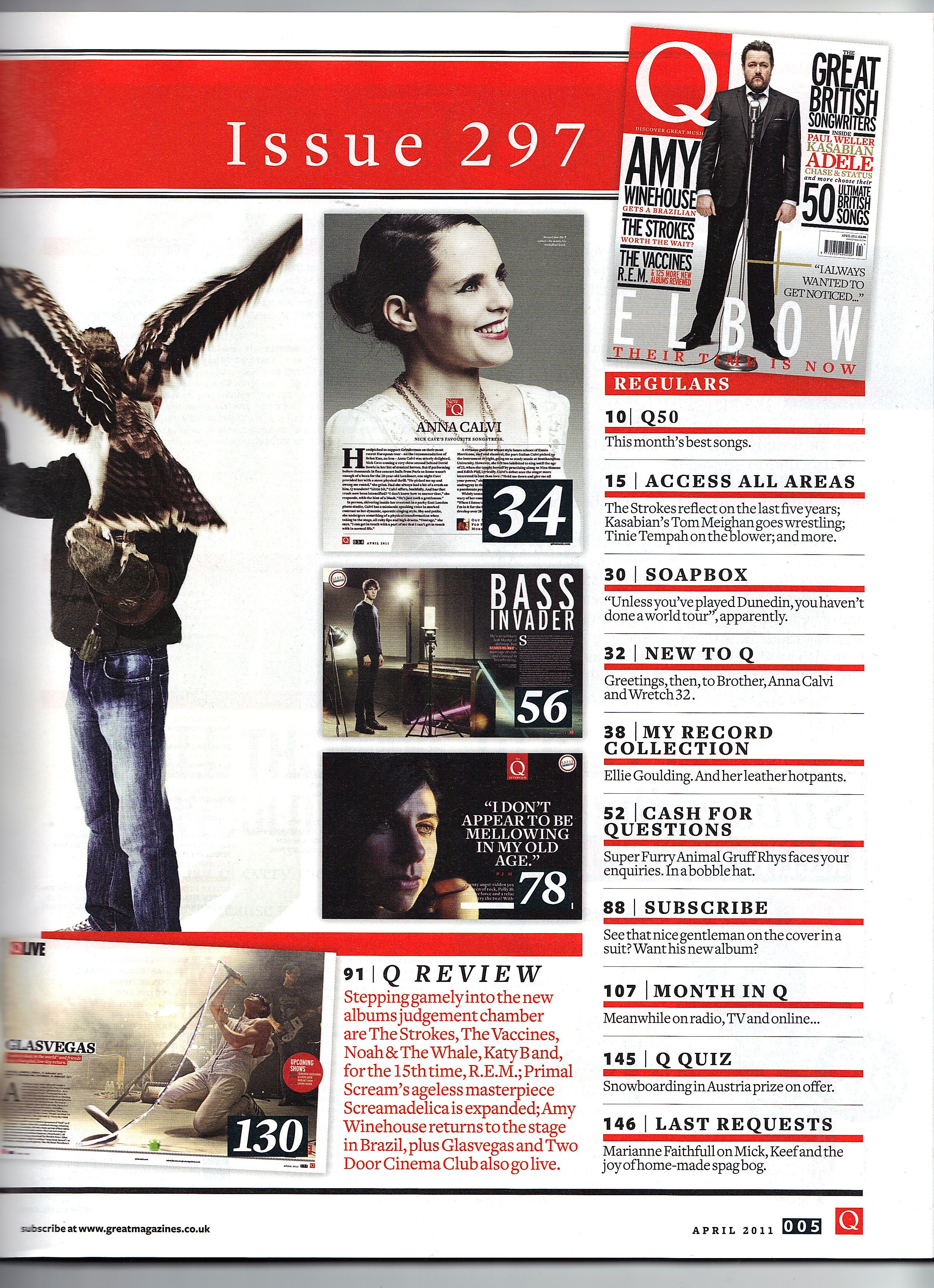 |
| Although this cover is successful as it is organised and neat, I feel as though there is too much going on. The pictures squash the text into one corner of the page and the various pictures make it difficult to focus on a specific one. I will try to avoid this in my magazine as although the photos are important, I am aware that younger people are more easily influenced and so I would rather they focus on the content of my magazine. Therefore, I think that I will have more writing than pictures on my contents page. |
 |
| This Billboard contents page looks good. The colour scheme is well organised and the text plays a bigger part on the page than the photos which I appreciate more. Furthermore I like the varied sizes of text,as it separates more relevant topics from those that may not be as relevant. I will also use this in my contents page. |
 |
| I like the minimal approach of this magazine. The red numbering along the sides of page titles contrasts against the black text, making the text look more important as red is a colour that connotes urgency. I will try to use red page numbers too. |
 |
| The colours on the page go together really well and compliment the main image. I was planning on using three pictures on my cover but this also looks very good. I like that the word contents is broken down into three pieces, I will not use this on my contents page but it is definitely a good trick to use extra space and also add to the aesthetics of the page. Perhaps I might use this idea on my double page spread, maybe break down a quote into three pieces of text. |
Saturday, 30 January 2016
Final audience feedback for cover
I showed 16 students at my school the cover and asked them for their comments, below is a sample of some quotes on what 6 out of 16 of them said in response.
P1: Female, aged 17, Year 12
"I like the colours and the half blue half pink looks cool."
"I would buy this if the articles inside were good, the cover would make me pick it up to check it out anyway though."
"I think it looks quite edgy and tough. It does look like a hip hop magazine to me because there are rappers down the side and her hoop earrings."
P2: Male, aged 16, Year 11
"Yeah I would buy it, it's got some of my favourite rappers on the cover."
"She looks cool but also like she has a lot of attitude. I think that's a good picture of her, it suits hip hop because everyone's supposed to look 'hard'."
"My favourite thing about the page is the picture I really like the effect it makes the magazine look different to others."
P3: Male, aged 18, Year 13
"I would definitely pick up this magazine in a store or something. I think it looks cool. It looks artistic but at the same time I can tell it's hip hop."
"I think this would cost around £4? I wouldn't mind because you said it comes out once a month and it looks like it would be good quality so it would be worth it for sure."
P4: Male, aged 17, Year 12
"It looks good I like it."
"The best part is the title of the magazine; in my opinion. I don't think I've seen a magazine with a title that goes down the side before so I like that, it seems creative."
"I would maybe buy it if I had money. It would definitely notice it though."
P5: Female, aged 16, Year 12
"This cover is really good I actually really like it."
"I don't really know how to improve it...Maybe add colours to the text instead of black. It looks nice like this though. Really professional."
"Yes, I would buy it. It looks unusual, I really like how you got the model to look at the camera she looks cool- like she doesn't care."
P6: Female, aged 18, Year 13
"I like it."
"The colours are good, the text is nicely alligned. I think it fits the conventions of music magazines well. Welldone."
"I don't know if I would buy it but I would probably pick it up and look inside."
I asked 10 more students at my sixthform and secondary, the answers were along the lines of those above. Overall, I have found that my magazine cover does appeal to my target audience. They especially liked the colours and the half/half effect.
P1: Female, aged 17, Year 12
"I like the colours and the half blue half pink looks cool."
"I would buy this if the articles inside were good, the cover would make me pick it up to check it out anyway though."
"I think it looks quite edgy and tough. It does look like a hip hop magazine to me because there are rappers down the side and her hoop earrings."
P2: Male, aged 16, Year 11
"Yeah I would buy it, it's got some of my favourite rappers on the cover."
"She looks cool but also like she has a lot of attitude. I think that's a good picture of her, it suits hip hop because everyone's supposed to look 'hard'."
"My favourite thing about the page is the picture I really like the effect it makes the magazine look different to others."
P3: Male, aged 18, Year 13
"I would definitely pick up this magazine in a store or something. I think it looks cool. It looks artistic but at the same time I can tell it's hip hop."
"I think this would cost around £4? I wouldn't mind because you said it comes out once a month and it looks like it would be good quality so it would be worth it for sure."
P4: Male, aged 17, Year 12
"It looks good I like it."
"The best part is the title of the magazine; in my opinion. I don't think I've seen a magazine with a title that goes down the side before so I like that, it seems creative."
"I would maybe buy it if I had money. It would definitely notice it though."
P5: Female, aged 16, Year 12
"This cover is really good I actually really like it."
"I don't really know how to improve it...Maybe add colours to the text instead of black. It looks nice like this though. Really professional."
"Yes, I would buy it. It looks unusual, I really like how you got the model to look at the camera she looks cool- like she doesn't care."
P6: Female, aged 18, Year 13
"I like it."
"The colours are good, the text is nicely alligned. I think it fits the conventions of music magazines well. Welldone."
"I don't know if I would buy it but I would probably pick it up and look inside."
I asked 10 more students at my sixthform and secondary, the answers were along the lines of those above. Overall, I have found that my magazine cover does appeal to my target audience. They especially liked the colours and the half/half effect.
Wednesday, 27 January 2016
Cover, Final and update.
 |
| These are the three main stages of my cover, in which I was making crucial decision about the house style of my page. I did use the Directors criticisms as some constructive feedback and changed the size of the model to decrease the amount of white space on the page. To further reduce this I added my tagline and date: "JANUARY 16: A JOURNEY INTO SOUND" this tagline will change every month, e.g. "FEBRUARY 16: A JOURNEY INTO SOUND". In addition to this, combining the tagline and date allowed me to remove the date line next to the bar code (AUGUST 2015) which improved the overall look of my page as it now appears less clustered. |
 |
| This is my final cover: I created my final cover by mainly relying on the grid view so that I could place everything in it's proper position on the page to avoid disrupting the harmony of the composition of graphics. I believe the gradient layer with altered opacity levels was a significant factor in improving the aesthetic of my cover as it made it appear more professional. This links back to my Target Audience research, in which one of the students I interviewed commented that the colours were too bright. I tackled this issue with the use of the additional layer as it matified the colours and reduced the brightness, causing my magazine to look less "cheap" and tacky. Furthermore, I did reduce the specs around the anchoring text which also made the writing more legible. I also followed the feedback of another student I interviewed and reduced the size of the sell lines to create more space around my model's head, this makes her the focal point of the page and strengthens her importance on it. This factor, combined with the direct mode of address and shot angle/zoom creates what I believe is a powerful image, with a look that is almost careless yet also very mindful. I believe the colours on the page all work together very well. |
 |
| Close-up of tag line on page. |
 |
I believe the half/half filtered image links to the anchoring text as it shows the transition of a person, implying her metamorphosis was overwhelming as it was portrayed visually on a cover. The effect also links to the belief around hip hop, the ideas surrounding people's alter egos in the industry: having to act hard or as someone you are not. This is presented in the use of two contrasting colour schemes on one model, showing a clash of two natures in one person. |
 |
| I continued the half/half idea into the anchoring text also to suit the house style. |
 |
| New bar-code, less clustered, looks more professional. |
Subscribe to:
Posts (Atom)