 |
| My media teacher let me borrow this book to look at some tips on photography. It enforced my belief that a picture is worth a thousand words, and gave me some new ideas about editing my cover image. For example, I am right now exploring different colour effects on my pictures (B&W, Blue Omni etc.) This book gives good guidance on how to create photos with depth by controlling the mise-en-scene and shooting the photo at the right moment to capture the feelings. |
Monday, 11 January 2016
Research: "Read This If You Want To Take Great Photographs Of People" by Kenny Carroll

Sunday, 10 January 2016
Final photo shoots for cover image 10-20 December


This photo shoot was more successful than my last one as the costume is more vibrant, the hair style also suits the conventions of Hip-Hop. I will use one of these pictures as my cover image.


One of these will be for my contents page.
Wednesday, 23 December 2015
Developing Cover 2


When creating the initial design I used the magnetic lasso tool to create new layers in order to move the model ahead of all sell lines and the masthead. This was to portray the importance of my "celebrity". Also, using the tool enabled me to blur the original background copy which made the copied layer stand out more, again highlighting his importance and stance on the cover. The contrasting colours work well to create a 'hard edge'.
To emphasise this contrast I added elements of red and white to the text which was placed above transparent boxes.

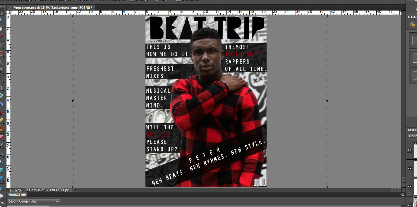

Small details like the barcode, issue number, price and the contrasting layers all add to the overall quality of the page. If I do decide to use this as my final cover then I will continue to develop it and post the stages on my blog.
Sunday, 20 December 2015
First attempts at front cover

These are not my final covers, they are my attempt at creating cover pages and exploring different themes. These covers are successful as they apply my selected colour scheme, the costumes (caps, hoodies, beanie hats. bold colours) are all conventional of modern-day hip hop. In 2/3 of the covers I used direct mode of address as this was a trend amongst other hiphop magazines such as XXL and Vibe. The first cover is my least favourite as it looks empty and cheap. The second cover is my most preferred as it is bold, unique and fierce. The colours, image and font all work really well together. My final cover will be of a similar look to this. I decided to use lines to recreate/link to the pattern on his jumper, while also making the text more accessible as it was difficult to read without the box due to the background.
*EDIT* As I have not yet taken any other pictures, I have decided to further develop the top right cover (second) and improve it. This may be my final cover.
Thursday, 17 December 2015
Photo shoots for potential cover image & contents page images. 19 Sep-21 Nov

 |
| This photo shoot went very well as my model was confident and able to step out of his comfort zone for my pictures. |

 |


 |
| This shoot was not as successful as my models were not as confident, however I can still use one or two on my cover page. |


Tuesday, 15 December 2015
Photoshoot Schedule


Thursday, 10 December 2015
Magazine Pitch
Today we pitched our initial magazine ideas to the class. The password to view my pitch is: media
Subscribe to:
Posts (Atom)