Saturday, 6 February 2016

Possible contents page lay out ideas

Here are two ideas that I have for my contents page lay out drawn in rough.

The picture on the right follows magazine conventions and is inspired by other AS contents pages I have come across online. However, the lay out on the left is more original. Nevertheless, after looking at more professional magazines (such as Dazed & Confused), I have realised that I may have too many photos on the pages whereas the professionals have kept the pages minimal. I believe the minimal approach would work better with my front cover so I will plan a new lay out, with perhaps less images (maybe 2/3) and an interesting background.

Thursday, 4 February 2016

Contents page research

Although this cover is successful as it is organised and neat, I feel as though there is too much going on. The pictures squash the text into one corner of the page and the various pictures make it difficult to focus on a specific one. I will try to avoid this in my magazine as although the photos are important, I am aware that younger people are more easily influenced and so I would rather they focus on the content of my magazine. Therefore, I think that I will have more writing than pictures on my contents page.
This Billboard contents page looks good. The colour scheme is well organised and the text plays a bigger part on the page than the photos which I appreciate more. Furthermore I like the varied sizes of text,as it separates more relevant topics from those that may not be as relevant. I will also use this in my contents page.
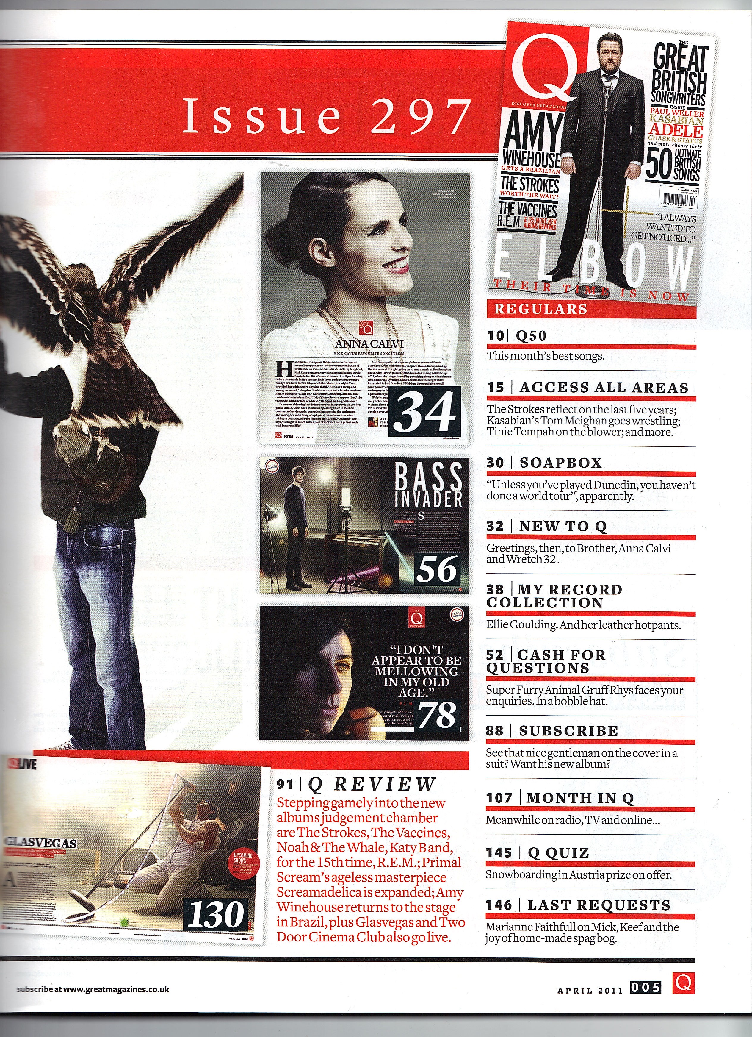
I like the minimal approach of this magazine. The red numbering along the sides of page titles contrasts against the black text, making the text look more important as red is a colour that connotes urgency. I will try to use red page numbers too.

The colours on the page go together really well and compliment the main image. I was planning on using three pictures on my cover but this also looks very good. I like that the word contents is broken down into three pieces, I will not use this on my contents page but it is definitely a good trick to use extra space and also add to the aesthetics of the page. Perhaps I might use this idea on my double page spread, maybe break down a quote into three pieces of text.

Saturday, 30 January 2016

Final audience feedback for cover

I showed 16 students at my school the cover and asked them for their comments, below is a sample of  some quotes on what 6 out of 16 of them said in response.

P1: Female, aged 17, Year 12
"I like the colours and the half blue half pink looks cool."
"I would buy this if the articles inside were good, the cover would make me pick it up to check it out anyway though."
"I think it looks quite edgy and tough. It does look like a hip hop magazine to me because there are rappers down the side and her hoop earrings."

P2: Male, aged 16, Year 11
"Yeah I would buy it, it's got some of my favourite rappers on the cover."
"She looks cool but also like she has a lot of attitude. I think that's a good picture of her, it suits hip hop because everyone's supposed to look 'hard'."
"My favourite thing about the page is the picture I really like the effect it makes the magazine look different to others."

P3: Male, aged 18, Year 13
"I would definitely pick up this magazine in a store or something. I think it looks cool. It looks artistic but at the same time I can tell it's hip hop."
"I think this would cost around £4? I wouldn't mind because you said it comes out once a month and it looks like it would be good quality so it would be worth it for sure."

P4: Male, aged 17, Year 12
"It looks good I like it."
"The best part is the title of the magazine; in my opinion. I don't think I've seen a magazine with a title that goes down the side before so I like that, it seems creative."
"I would maybe buy it if I had money. It would definitely notice it though."

P5: Female, aged 16, Year 12
"This cover is really good I actually really like it."
"I don't really know how to improve it...Maybe add colours to the text instead of black. It looks nice like this though. Really professional."
"Yes, I would buy it. It looks unusual, I really like how you got the model to look at the camera she looks cool- like she doesn't care."

P6: Female, aged 18, Year 13
"I like it."
"The colours are good, the text is nicely alligned. I think it fits the conventions of music magazines well. Welldone."
"I don't know if I would buy it but I would probably pick it up and look inside."

I asked 10 more students at my sixthform and secondary, the answers were along the lines of those above. Overall, I have found that my magazine cover does appeal to my target audience. They especially liked the colours and the half/half effect.

Wednesday, 27 January 2016

Cover, Final and update.


These are the three main stages of my cover, in which I was making crucial decision about the house style of my page. I did use the Directors criticisms as some constructive feedback and changed the size of the model to decrease the amount of white space on the page. To further reduce this I added my tagline and date: "JANUARY 16: A JOURNEY INTO SOUND" this tagline will change every month, e.g. "FEBRUARY 16: A JOURNEY INTO SOUND".  In addition to this, combining the tagline and date allowed me to remove the date line next to the bar code (AUGUST 2015) which improved the overall look of my page as it now appears less clustered. 
This is my final cover:
I created my final cover by mainly relying on the grid view so that I could place everything in it's proper position on the page to avoid disrupting the harmony of the composition of graphics. 
I believe the gradient layer with altered opacity levels was a significant factor in improving the aesthetic of my cover as it made it appear more professional. This links back to my Target Audience research, in which one of the students I interviewed commented that the colours were too bright. I tackled this issue with the use of the additional layer as it matified the colours and reduced the brightness, causing my magazine to look less "cheap" and tacky. 
Furthermore, I did reduce the specs around the anchoring text which also made the writing more legible. I also followed the feedback of another student I interviewed and reduced the size of the sell lines to create more space around my model's head, this makes her the focal point of the page and strengthens her importance on it. This factor, combined with the direct mode of address and shot angle/zoom creates what I believe is a powerful image, with a look that is almost careless yet also very mindful.
I believe the colours on the page all work together very well. 

Close-up of tag line on page. 


I believe the half/half filtered image links to the anchoring text as it shows the transition of a person,  implying her metamorphosis was overwhelming as it was portrayed visually on a cover. The effect also links to the belief around hip hop, the ideas surrounding people's alter egos in the industry: having to act hard or as someone you are not. This is presented in the use of two contrasting colour schemes on one model, showing a clash of two natures in one person.

I continued the half/half idea into the anchoring text also to suit the house style.


New bar-code, less clustered, looks more professional. 

Wednesday, 20 January 2016

First audience feedback for cover

"Would you buy this magazine?"
7/10 said Yes
3/10 said No

"Does this cover look complete?"
6/10 said Yes
4/10 said No

"What genre of music do you think this magazine is for?"
6/10 said hip hop
3/10 said R&B
1/10 said EDM

"Do you have any further comments or feedback so I can improve?"
5/10 said Yes
5/10 said No

Here are some quotes from 3/5 students that voted Yes.
P1: Female, aged 16, Year 11
"This is a good cover but I don't know if I think it looks real, as if it was made by a professional."
"I think to improve it you should change the writing size."

P2: Female, aged 18, Year 13
"It's a good first try but you can definitley improve it. The colours look too bright and it makes the overall cover seem kind of...cheap?"

P3: Male, aged 17, Year 12
"I like the picture. Maybe the writing is a little too close to her. But as a whole I like the page for sure."


Friday, 15 January 2016

Cover Stages & Production

This was my very first cover image, however, I felt as though it was lacking character so I decided not to use it.

I decided to use a close up shot instead of a medium close up, as I felt it communicated the emotions expressed by the model and cover page more effectively.
I was still adding sell-lines around the head of my model.  This was so I could partly portray that she is the most important graphic on the page by drawing more attention to her face, which is composed centrally.


I achieved this look by accident when highlighting parts of my page, but I felt as though it gave my magazine an unusual look and made it look 'cool' as it emphasized on the idea of being unique. This inspired me to play with negative filters and experiment with my cover image a little more.


After splitting my image in half, (half negative filter) I decided changing half of the anchoring text would make it suit the house style more.


This is how the original bar-code layout of my magazine was. However, I have decided to change it to appear less 'clunky'.
This is my initial cover:
 I recently was given the opportunity to talk to the Art Director of Glass Magazine, who said that he really liked my cover and was able to guess the genre of music it belonged to. This was important as it showed that my cover page relates to the genre of music I am targeting. However, he did also give me some critical feedback, this was that the text is too close to the models head, and that the anchoring text could be pushed down or the model's head could be pushed up to allow her to be easily seen. I will be making these changes and some more corrections that I have noticed myself over the next few days. For example, the 'specs' of coloration around the anchoring text are distracting, so I will use the clone stamp to make the image have block colours around the text instead. Furthermore, I will add a layer of nearly transparent purple to white gradient over the top of the cover to make it appear less tacky/bright and to create a 'flossy but matte' finish to the page. I will also take into account the advice Ben gave me as I am currently planning on reducing the size of the sell lines, and perhaps putting my tag line at the top of the page to fill in the empty white space which the Director commented: "makes me feel like there's something missing" and is "distracting". 


Thursday, 14 January 2016

Cover page final ideas


I have decided to use this filter as I think it makes the cover look unique and vibrant. Furthermore, this will appeal to my T.A of 16 - 19 year old young adults as it will stand out and make a bold, eye catching statement. A bold statement is something that my target audience favours.

However, I have not decided which picture I will use with the filter so I will try the scheme with the above two pictures and pick the best final cover - much like industry professionals who make several covers and then pick a final one. This is because it gives people a better idea and perspective on their work, and helps them to make the best out of a concept.